With a stay at home mandate, we can pause and see what we wanted to do, but didn’t have “enough” time. Now, many of us have more free time than ever before!
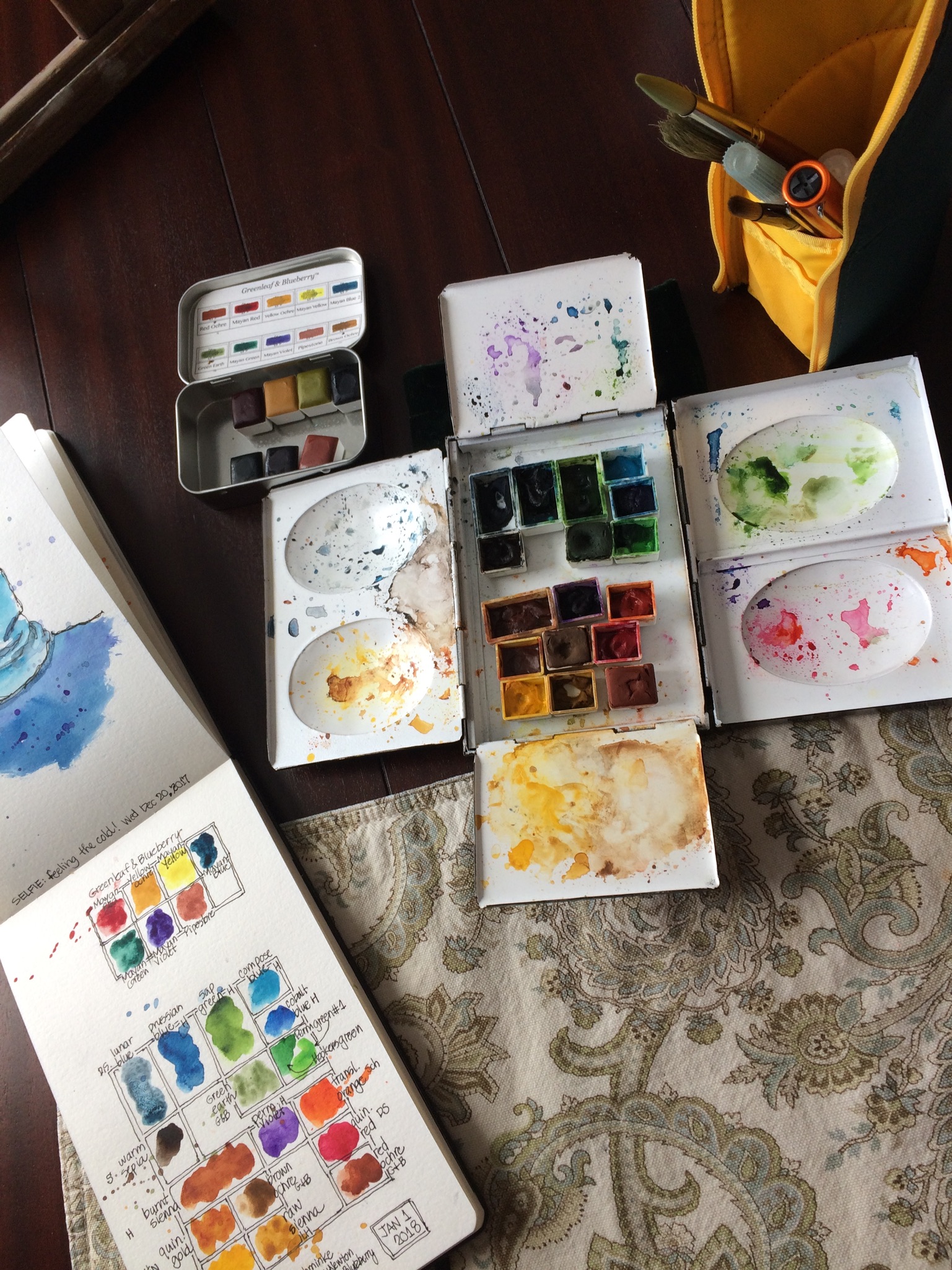
I took advantage of this to update and switch to a different watercolor palette, made by Craig Young. It’s not new, it’s been here for 5 years, and I haven’t used it because it seemed too heavy for urban sketching. After spending a couple weeks with other artists who manage just fine with even larger palettes, this one doesn’t seem as heavy.
There’s more space to mix colors, and I’ve adapted it to fit my pans with magnets, as I never know when I might dare to switch a color! (See my list of colors below.)
What are your favorite colors?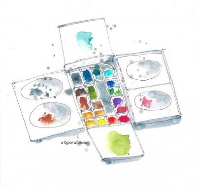
It’s interesting how different two cobalt turquoises can be! I bought the Schminke one for New Zealand, and while there, I got a sample of a Windsor & Newton one, and do love both of them!
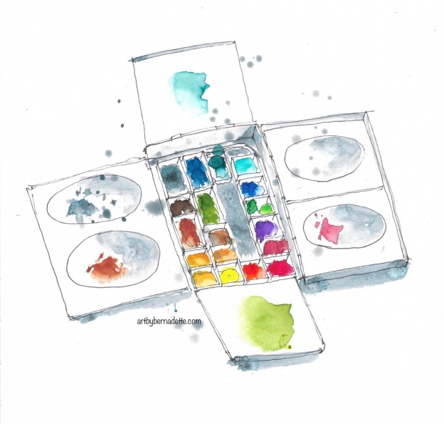
Top row: Lunar blue (DS), Prussian blue, Cobalt turquoise (W&N), Cobalt turquoise (Schminke)
Second row: Warm sepia, Sap green, Cobalt blue
Third row: Burnt sienna, Brown ochre (DS), Hooker’s green with Perm. green, Perm. violet
Fourth row: Quin. gold (W&N), Raw sienna, Alizarin crimson (W&N)
Bottom row: Perm. yellow deep, Perm. yellow lemon, Translucent orange (Schminke), Quin. red (DS).
Note: all colors are Holbein, except where labeled.